Key Takeaways:
- Charting is an essential part of your trading journey and will help you become a success
- The trend is your friend, and we show you how to use it to your advantage
How to Read Forex Charts?
Every financial asset has a certain history to its name. This same history illustrates its past behavior and serves to show where the given asset has been in terms of valuation. In other words, the history is the chart.
To this end, reading charts could give you an edge you would need in trading the financial markets. How could this happen? By successfully interpreting charts, you could enhance your chances of getting your position right. For example, forex charts, which show you the past movement of currency pairs, can give you a hint where the pair may go next.
In more detail, learning how to read and use forex charts could be your gateway to trading. Moreover, once you begin to understand how charts work, you will most likely be surprised by all they offer you.
What Chart Reading Can do for You?
Essentially, this is what chart reading, or “tape reading”, could give you:
- Visual representation of price behavior – charts show you where price has been. What you can do with it, is spot inflexion points, or trend reversals, and go back to see the catalyst for this move. It could be economic reports like jobs data, or a press conference from the US Federal Reserve.
- Assess the probability of the next move’s direction – once you’ve defined a clear trend, it’s time to take action on it. By using the chart, you should be able to assess the probability of the price moving higher or lower.
- Market sentiment and price patterns – to best weigh your chances when reading the chart, you can analyze market sentiment and price patterns. Market sentiment will help you grasp the general mood, whether positive or negative. And price patterns will show you if there’s a price model that you need to be following in order to ride the move or the trend.
Understanding Market Trends
What’s a trend and how to use it? In trading, a trend is the major principle upon which the move of any financial asset is based. Every market, be it currencies, stocks, or crypto, trends all the time. And traders and investors read, or interpret, the trend, before they jump in the market.
The trend could either move upside, downside, or sideways. Ideally, if you want to buy, the trend should go higher. And vice versa – if you sell, the trend should be going lower. And that’s the tricky part.
You need to identify trend changes at their earliest stage so you could ride out the volatility that would carry you into considerable profits. One thing you have to know is that the trend is your friend.
Trends will mostly behave the same, regardless of their time frame. A five-minute trend in the EUR/USD will have the same specifics as the trend in gold since the Great Depression. To this end, it’s best to decide for yourself whether you want to stick to shorter time horizons or longer-term trends.
Types of Trading Charts
Trading charts have several types. All of them are just different representations of the same price action. At TradeOr, you may choose between the following trading charts:
- Bars – a bar chart shows you information for the price in the form of bars. These bars hold key insights into the price behavior. In practice, they illustrate what the price did in the specified time frame. A bar consists of the opening foot (facing left), a vertical line (the move), and a closing foot (facing right). The bar also shows the lowest point and the highest point.
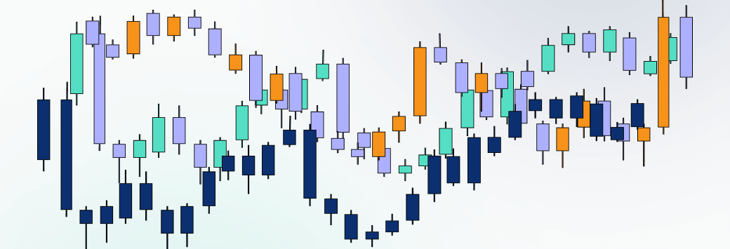
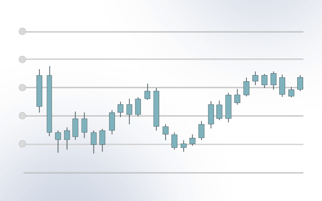
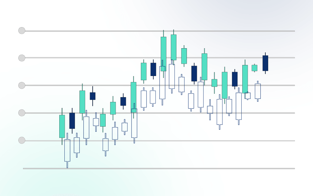
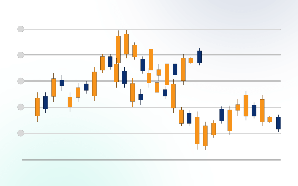
- Candles – Candles are perhaps the most used type of trading chart. With origins dating back to mid-1600s, chart analysis based on candles was first used in Japan. Candles, also called candlesticks, are a variation of the bars, but with a few improvements. They represent price movements in a more pronounced and easier way. The vertical bar shows the fluctuation of the asset’s price during the specified time. The thin lines below and above are called “shadows”, or “wicks”, and indicate the lowest, and the highest point, respectively. You can easily see how this type of chart got its name: it resembles a candle.
- Hollow candles – hollow candles are identical to the regular candles. The only difference is they are hollow, instead of coloured.
- Heikin Ashi – this type of chart aims to identify an uninterrupted uptrend or downtrend as it filters out the noise. It’s similar to candlesticks but without the market fluctuations.
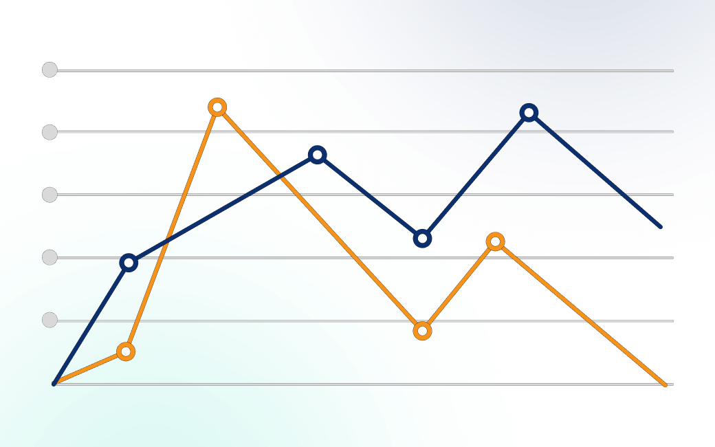
- Line – a line chart portrays the price data as a series of moves based entirely on a line. In other words, the chart is represented as a line that moves up, down, or sideways, depending on the direction of the trend.

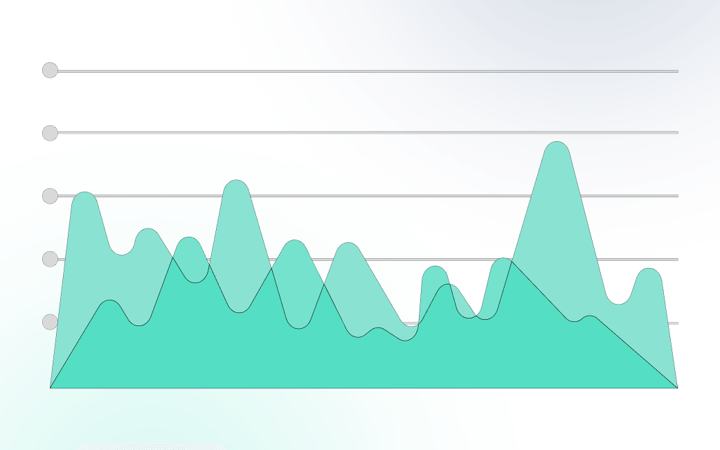
- Area – an area chart, also known as a mountain chart, is similar to the line chart. The main difference is that area charts visualize volumes, hence the name: area, or mountain.
- Baseline – a baseline chart is based on the line chart with the added element of an average base line. The baseline serves as a mean and helps you determine price fluctuations that go above and beyond this averaging line.
Candlesticks Explained
As mentioned earlier, candlesticks are perhaps the most popular charting method. Moreover, once you get familiarized with charting, you are likely to pick this method for your own trading style. In essence, candlesticks represent price moves based on a specified time frame. It could be a 5-minute chart or a daily chart.
With this in mind, candlesticks can take a variety of interesting sizes. Some may have a long lower wick, which would indicate a sharp slide or even a flash crash. Others may paint a long upper wick to show a spike in the price.
Regardless, candlesticks could be used as a way to determine price patterns, spot trends, and open positions.
Graph analysis
Graph analysis is the act of analyzing charts based on several graph types. In short, these are:
- Line graphs;
- Pie charts;
- Scatter plots;
- Histograms;
Graph charts are used not only in trading but also in a wide range of industries. They are an effective way to visualize data and showcase statistics.
Summary
With all of the above, it is fair to say that chart reading is a strong method to put technical analysis to work. If you learn to successfully interpret charts, you could be able to forecast where the price will head next.
Remember that monthly, weekly, daily, and even intraday charting could be used to plot your next move. And regardless of the type of chart you use, the trend is there to help you ride the move and make money. In other words, the earlier you “jump” on the trend, the more money you will make.
FAQ
- What are charts used for in trading?
Charts are used in trading to display past price behavior. They help identify trends that have occurred and have the probability to either continue or reverse in the future. Therefore, charts are used to spot trend formations, continuations, or reversals. Charts also hold key patterns that help traders decide when to jump in the market.
- How to read charts in forex?
Reading charts in forex will help you identity entry and exit points. Specifically, you need to spot where price may turn or create a new trend. The chart is there to help you assess price’s next move.
- How can reading charts help traders?
Reading charts can help traders spot trends. Ideally, you would want to jump on the trend as early as possible. The chart will show you where a trend may continue, or break. Your job is to make sure you got it correctly and then ride out the wave.